How to Review Business Analytics and Floor Heat Map
Evaluating revenue, average checks, order volume, dish popularity, and table performance heat maps.
Who can do thisRestaurant Owners.
Steps
1
Open Business or Restaurant Overview
In the Owner console, go to Overview (`/owner/analytics`).
Use the scope picker in the header to view metrics across all locations or focus on a single restaurant.
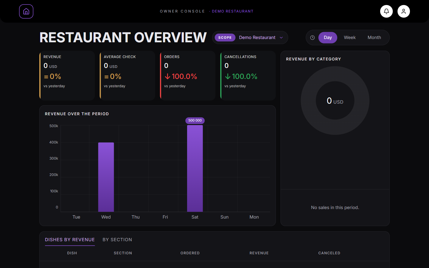
Key figuresOwner console → Analytics. Revenue, average check, orders and cancellations lead the page.
2
Select reporting period
Use the period switch in the header to select Day, Week, or Month.
Key performance indicators display: Total Revenue, Average Check, Total Orders, and comparison percentages against the prior period (e.g. vs yesterday or vs last month).
Review the Revenue Bars chart and Category Donut ring.
Switch between "Dishes by revenue" and "By section" to see which menu items generate the highest sales volume.
By categoryRevenue by category is on the right, next to the revenue chart.
4
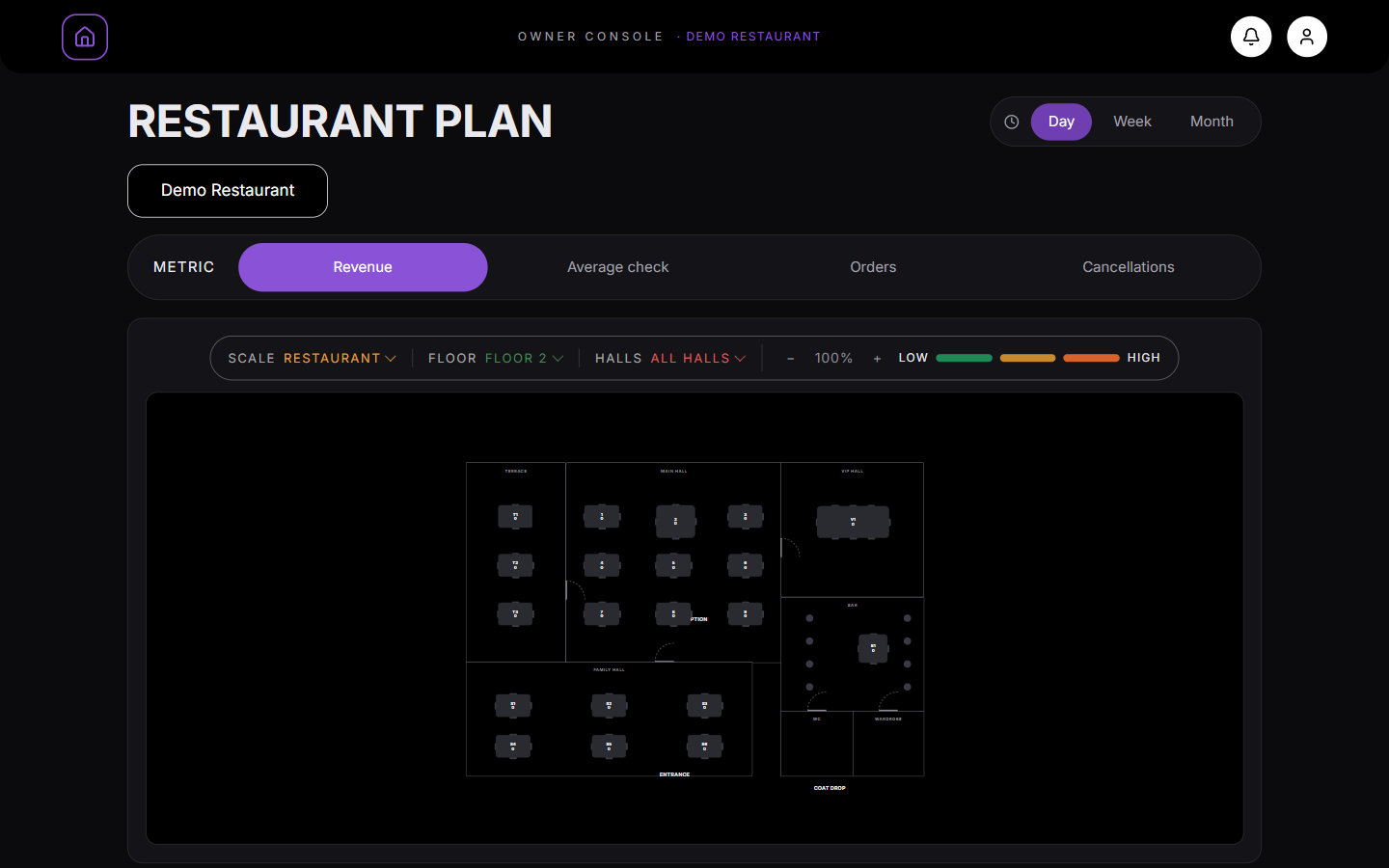
Inspect the Floor Heat Map
Navigate to Floor (`/owner/plan`).
Every table on your floor scheme is painted with heat colors based on performance. Choose your metric: Revenue, Average Check, Orders, or Cancellations.
MetricScale, floor, hallsOwner console → Floor. Choose a metric and every table on the plan is coloured from low to high.
5
Drill into specific table metrics
Click on any table on the heat map to see its specific revenue, order count, and top-selling dishes.
This identifies high-performing areas and tables with lower turnover or high cancellation rates.
What you should see
You have comprehensive visibility into revenue drivers and dining room floor dynamics.
Good to know
Analytics reflect finalized revenue from accepted and served orders.